

Responsive Website Design for All Devices and Screen Sizes


15 Years of Experience
5.0 Rating Reviews
Responsive Website Experts
70+ Trusted Clients
Why Responsive Design Matters
Deliver a seamless user experience across all devices, including mobile, tablet, and desktop
Enhance SEO performance with mobile-first indexing and better search visibility
Increase conversions and user engagement with optimized layouts and usability
Improve website speed and performance on mobile devices for better user retention
Responsive Web Design Services for US Clients
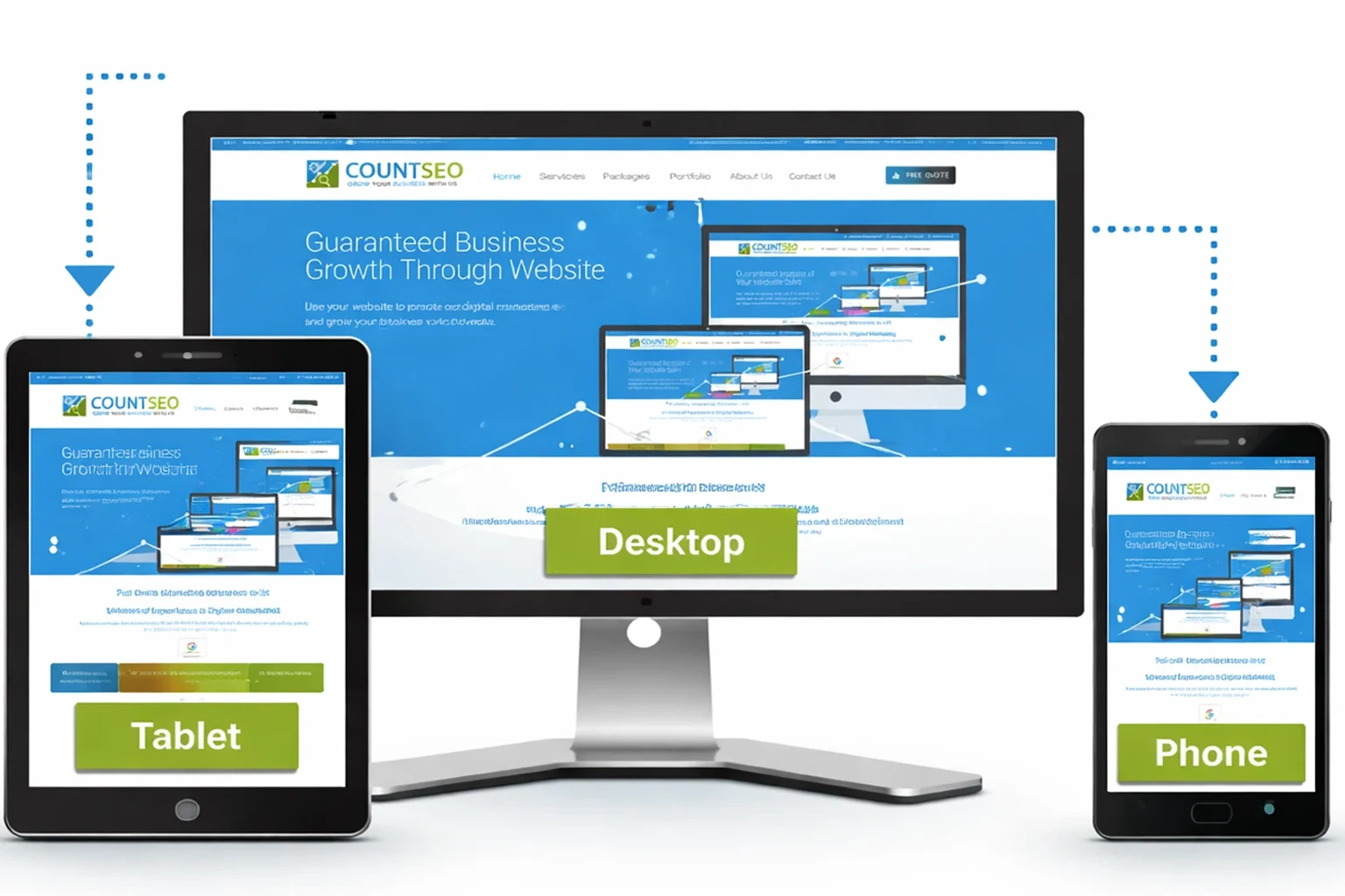
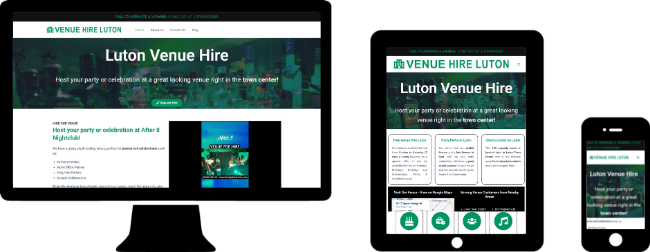
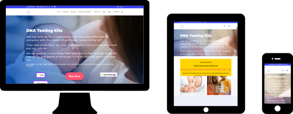
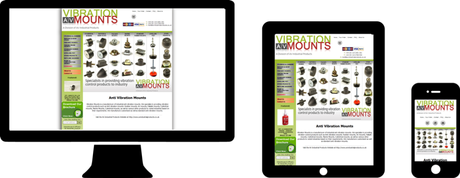
Desktop, Laptop, Tablet and Mobile
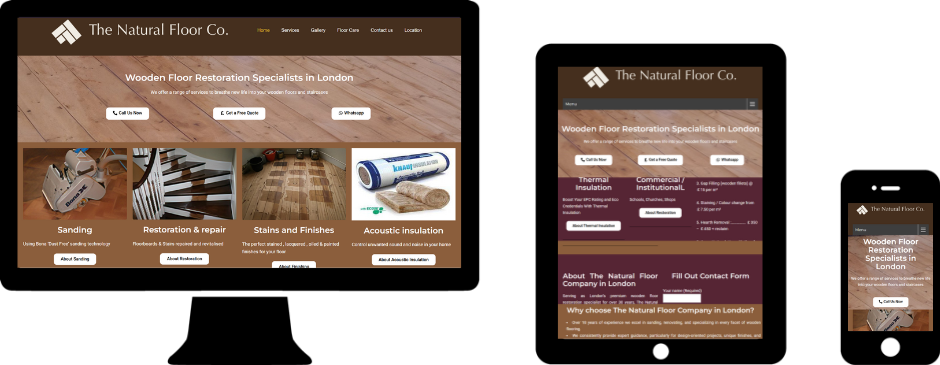
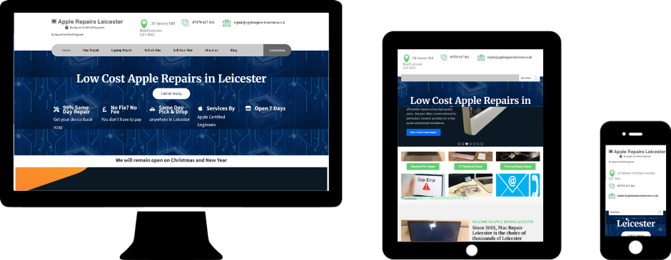
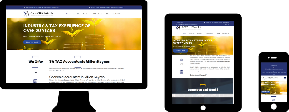


Our Responsive Design Services
Tablet and Desktop Optimization
Your website is fully optimized for tablets and desktops, delivering a consistent and seamless experience on every device.
Mobile-First Website Design
We design websites with a mobile-first approach, ensuring optimal performance and user experience across all screen sizes from the start.
UI/UX Enhancement
We improve user interface and user experience to make your website visually appealing, easy to navigate, SEO-friendly, and user-friendly.
Speed Optimization
Our team enhances website speed and performance, reducing load times and improving overall user satisfaction and SEO.
Cross-Browser Compatibility
We ensure your website works perfectly across all major browsers, including Chrome, Safari, Edge, and Firefox.
Conversion-Focused Layout
We design layouts strategically to guide users toward action, helping increase leads, conversions, and business growth.
How Our Responsive Design Process Works
Step 1: Research & Planning
We start by understanding your business goals, target audience, and competitors to build a strong, data-driven strategy.
Step 2: Wireframing & Design
Our team creates intuitive wireframes and modern designs focused on user experience, functionality, and visual appeal.
Step 3: Development
We develop a fast, responsive, and fully functional website using the latest technologies for seamless performance across all devices.
Step 4: Testing and Launch
We thoroughly test your website on all devices before launch, then continuously monitor and optimize performance for the best results.
Benefits of Responsive Design
Seamless Experience Across All Devices
Ensure a smooth and consistent user experience on mobile, tablet, and desktop.
Increased Traffic & Engagement
Attract more visitors and keep them engaged with a mobile-optimized, user-friendly design.
Lower Bounce Rate & Better Performance
Fast loading speeds and easy navigation help reduce drop-offs and improve user retention.
Higher Conversions & ROI (Return on Investment)
Turn more visitors into customers with a conversion-focused responsive website.
The Tools We Use to Build Responsive Websites



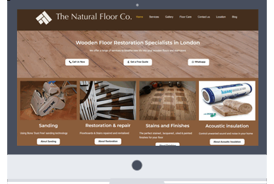
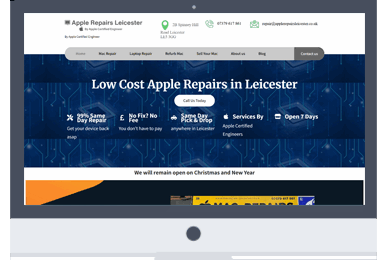
Responsive Website Case Studies

Client Testimonials

“Mahesh has excellent communication skills, provides quick responses, and is highly experienced in website design and search engine ranking. He has been working on my website for the past 4 years, and I am very happy with the results.”
Trusted by Brands for Responsive Web Design





Frequently Asked Questions (FAQs)
Responsive design ensures your website works smoothly on all devices, providing a better user experience, improving engagement, and helping your site rank higher in search engines.
If your website is not already responsive, we can redesign or optimize it to ensure it performs perfectly on mobile, tablet, and desktop devices.
The timeline depends on the size and complexity of the project, but most responsive redesigns are completed within 2 to 6 weeks.
A proper redesign improves SEO by enhancing site structure, speed, and mobile performance while working to protect your existing rankings (rankings can’t be guaranteed during a redesign)
Yes, we can improve and redesign your current website while keeping valuable content, structure, and SEO intact.